A Biwheel chart is a powerful way to visualize relationships, cycles, and interactions in data using an interactive, circular layout. By placing two concentric “wheels” of information on top of each other, you can quickly see how elements compare, align, or evolve over time. This guide walks you through what a Biwheel chart is, when to use it, how to design it well, and which tools can help you build one.
What is a Biwheel Chart?
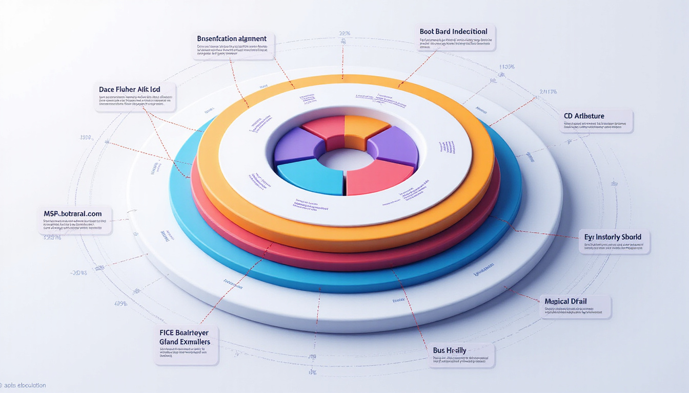
A Biwheel chart is a type of circular data visualization that uses two linked wheels (or rings):
- An inner wheel representing one set of categories or time periods.
- An outer wheel representing another set of categories, metrics, or states.
These two wheels are aligned around a shared center, allowing you to compare values, relationships, or changes between inner and outer segments at a glance. In interactive implementations, hovering or clicking segments reveals more information, highlights linked segments, or filters the view.
You can think of a Biwheel chart as a specialized extension of circular charts such as radial bar charts, polar area charts, or circular timelines, but built explicitly for comparisons between two rings.
When Should You Use a Biwheel Chart?
A Biwheel chart is not the right solution for every dataset. It works best when you want to:
-
Compare two related layers of information
- Example: Product categories (inner) and subcategories (outer), or portfolio sectors (inner) vs. individual assets (outer).
-
Show cyclical patterns or time-based data
- Example: Hours of the day (inner) and days of the week (outer); annual cycle (inner) and monthly breakdowns (outer).
-
Highlight relationships or alignments
- Example: Employee roles (inner wheel) and skill clusters (outer wheel); customer segments (inner) and preferred channels (outer).
-
Support exploratory analysis with interactivity
- When you want users to explore details on demand via hover, click, or filtering.
You may want to avoid a Biwheel chart when:
- You have very many categories (e.g., 100+ segments) that would create clutter.
- Your audience needs precise numeric comparison—bar or line charts are often clearer.
- The relationships between inner and outer rings are not well-defined or easily understood.
Core Components of a Biwheel Chart
A well-designed Biwheel chart typically includes:
1. Inner Wheel (Primary Dimension)
The inner ring often encodes:
- Time units (e.g., months, weeks, hours)
- Main categories (e.g., departments, regions, product lines)
- Stages or phases (e.g., steps in a process, lifecycle stages)
Segment size, color, or radial length may encode values such as counts, percentages, or averages.
2. Outer Wheel (Secondary Dimension)
The outer ring provides a second layer of data aligned with the inner ring:
- Subcategories or breakdowns
- Secondary metrics for the same categories
- “Before vs. after” or “current vs. target” scenarios
The outer wheel can use:
- Color to show performance bands or qualitative states
- Radial length/area to show numeric values
- Patterns or textures to indicate groups
3. Links, Highlights, and Interactions
For an interactive Biwheel chart, interactivity makes the dual structure understandable:
- Hover a segment to highlight corresponding segments in the other wheel
- Click to filter or drill down into details
- Tooltips showing exact values and labels
- Legends, color keys, and on-chart annotations
4. Supporting Elements
- Clear title and subtitle explaining the comparison
- Legends that decode color and size
- Explanatory text or callouts on significant patterns
- Possibly a timeline or filters for time-based exploration
Key Use Cases for a Biwheel Chart
1. Time and Seasonality
Use a Biwheel chart to show cyclic patterns:
- Inner wheel: 12 months
- Outer wheel: average daily temperature or energy usage
This reveals seasonality and peaks within each month in a compact, visual form.
2. Customer Segmentation and Channels
- Inner wheel: customer segments (e.g., enterprise, SMB, consumer)
- Outer wheel: preferred marketing channels (e.g., email, social, search)
A Biwheel chart makes it easy to see which segments rely heavily on specific channels, and where your marketing mix is unbalanced.
3. Workforce Skills and Roles
- Inner wheel: job roles or departments
- Outer wheel: key skill groups
This helps HR teams visualize skill coverage, identify gaps, and plan training or hiring.
4. Product Portfolio and Revenue Mix
- Inner wheel: product lines
- Outer wheel: product variants or SKUs, sized by revenue contribution
Decision-makers can quickly spot which product variants drive revenue within each line and where diversification is needed.
Designing an Effective Biwheel Chart
To make your Biwheel chart clear and useful, focus on clarity, hierarchy, and interactivity.
Choose the Right Data
Select data where:
- The relationship between inner and outer wheels is obvious: subsets, phases, or parallel metrics.
- The total number of segments remains reasonable. As a rule of thumb:
- Inner wheel: 5–24 segments
- Outer wheel: up to 2–4 segments per inner segment (more if interactive and zoomable)
Prioritize Readability Over Decoration
Circular visualizations are visually appealing but can be hard to read if overloaded. Keep in mind:
- Use consistent ordering (e.g., chronological, alphabetical, or by size).
- Avoid excessive color variety; group colors by category.
- Ensure labels are legible—use:
- Radial labels for inner segments
- Hover-based tooltips for detailed labels
- Short, recognizable names
Encode Values Thoughtfully
Common encodings in a Biwheel chart:
- Angle (arc length): good for share-of-whole comparisons.
- Radius (distance from center): effective but can be misread; use in combination with color or tooltips.
- Color intensity or hue: useful for categorical and qualitative differences (e.g., performance bands).
Do not rely on color alone for critical distinctions—use shapes, patterns, or text as needed to maintain accessibility.
Leverage Interactivity
An interactive Biwheel chart shines when it responds fluidly to user input:
- Hover:
- Highlight related segments across both wheels.
- Display tooltips with detailed metrics.
- Click:
- Drill into sub-groups.
- Filter by category or time.
- Controls:
- Dropdowns or sliders for time ranges.
- Toggle between metrics (e.g., revenue vs. margin).
User testing is crucial; watch how test users interpret the chart and adjust wording, legends, and interactions accordingly.
How to Build a Biwheel Chart Step-by-Step
Here is a high-level workflow to create a Biwheel chart, from data to deployment.
1. Prepare and Structure Your Data
Organize data into a structure similar to:
innerCategory(e.g., month, segment, role)outerCategory(e.g., subcategory, channel, skill)value(numeric metric)- Optional:
group,color, orlabelfields
Check data quality:
- Ensure every
outerCategorymaps to a validinnerCategory. - Remove or merge tiny categories that will be visually indistinguishable.
2. Select a Visualization Tool or Library
A Biwheel chart can be built with multiple tools:
- Code-based libraries
- D3.js: Maximum flexibility for custom interactive Biwheel charts.
- ECharts or Plotly: Faster setup with built-in polar/radial chart options.
- BI/Analytics tools
- Tableau, Power BI, and Looker can approximate a Biwheel with dual radial charts, though full interactivity may need custom extensions.
- Low-code/no-code tools
- Some data visualization platforms offer radial or multi-layer donut charts that can be adapted into a Biwheel-like layout.
According to visualization research, interactive and well-annotated visualizations significantly improve user comprehension and decision-making (source: IEEE VIS).
3. Map Data to Visual Elements
Define encodings:
- Inner ring:
- Angle:
innerCategory - Color: category or group
- Radius/length: primary metric (optional)
- Angle:
- Outer ring:
- Angle: aligned with corresponding inner segment
- Radius/length: secondary metric
- Color: performance band or subcategory
Add supporting components:
- Title and subtitles
- Legends for color and size
- Tooltips for inner and outer segments
4. Implement Interactivity
Focus on intuitive behaviors:
- Hover: highlight arc, fade others, show tooltip.
- Linked highlighting: hover inner arc to highlight all related outer arcs, and vice versa.
- Filtering/Drilldown:
- Click inner segment to zoom into its outer segments.
- Provide a “reset” or “back” control.
Test performance and responsiveness, especially if your Biwheel chart will be embedded in a dashboard or web application.
5. Validate and Iterate
Before finalizing:
- Review with stakeholders: does the Biwheel chart answer their key questions?
- Compare with alternative charts:
- Would a bar, line, or grouped bar chart deliver the insight more clearly?
- Simplify where possible:
- Remove redundant encodings.
- Clarify labels and legends.
Best Practices and Common Pitfalls
Best Practices
- Start with a clear question: “What comparison or relationship should this Biwheel chart reveal?”
- Limit the number of segments to prevent clutter.
- Use consistent color schemes to align with brand or domain conventions.
- Make the interactive Biwheel chart keyboard- and screen-reader-friendly whenever possible.
Common Pitfalls to Avoid
- Overstuffing the rings with tiny categories that are impossible to interpret.
- Using too many color shades with no clear legend.
- Encoding multiple metrics on the same dimension (e.g., length and angle for unrelated values).
- Forgetting a concise text explanation next to the chart.
Example Applications by Industry
To spark ideas, here are some ways different teams can use a Biwheel chart:
-
Marketing:
Inner wheel = customer lifecycle stage; outer wheel = most effective campaigns or channels for each stage. -
Operations:
Inner wheel = shifts or time blocks; outer wheel = incident counts or ticket volumes, colored by severity. -
Finance:
Inner wheel = asset classes; outer wheel = individual holdings, sized by allocation and colored by risk level. -
Product Management:
Inner wheel = product areas; outer wheel = key features, sized by usage, colored by satisfaction or NPS.
These use cases leverage the Biwheel chart’s key strength: a compact, intuitive overview of how two related structures interact.
Quick Design Checklist for Your Biwheel Chart
Use this checklist before you publish:
- [ ] Clear question and purpose defined
- [ ] Inner and outer wheels have a logical, explained relationship
- [ ] Number of segments is manageable and legible
- [ ] Color scheme is consistent and accessible
- [ ] Legends and labels explain encodings without ambiguity
- [ ] Interactivity (hover, click, filters) works smoothly
- [ ] Tooltips provide meaningful context, not just raw numbers
- [ ] Accompanying text explains how to read the Biwheel chart
FAQ About Biwheel Charts
Q1: What is a Biwheel chart used for in data analysis?
A Biwheel chart is used to compare two related layers of information—such as categories and subcategories, or time periods and metrics—within a single circular visualization. It helps analysts see patterns, relationships, and cyclical behavior that might be harder to spot in flat tables.
Q2: How is a Biwheel chart different from other circular data visualizations?
Unlike a simple donut or radial bar chart, a Biwheel chart has two coordinated rings designed specifically to show relationships between inner and outer segments. While both belong to the family of circular data visualizations, the Biwheel emphasizes comparison between layers rather than just share-of-whole.
Q3: Which tools can I use to create an interactive Biwheel chart?
You can build an interactive Biwheel chart with libraries like D3.js, ECharts, or Plotly, or approximate it in BI tools such as Tableau or Power BI using dual radial charts. For full control over interaction and styling, JavaScript-based libraries are usually the best option.
Start Experimenting with Biwheel Charts Today
An interactive Biwheel chart can transform how you and your audience understand complex, multi-layered data. By revealing connections between two concentric structures—such as segments and subsegments, times and events, or roles and skills—you unlock insights that flat charts often miss.
If you’re working with cyclical data or layered categories and need an intuitive, engaging way to explore them, now is the time to prototype your first Biwheel chart. Choose a focused dataset, pick a visualization tool that matches your skill level, and iterate with real users. The sooner you start experimenting, the sooner you’ll discover where Biwheel charts can become a core component of your analytics and storytelling toolkit.
Curious about why astrology has fascinated people for centuries? Explore evidence-based perspectives on spirituality, consciousness, and human psychology at SpiritualMindScience.com