In a world overflowing with dashboards, reports, and metrics, chart synthesis is the quiet superpower that separates confusing visuals from clear, compelling data stories. It’s not just about making a single chart look good; it’s about combining multiple charts, metrics, and perspectives into a coherent visual narrative that people can quickly understand and act on.
This guide walks through practical, people-first strategies for using chart synthesis to tell better data stories—whether you build dashboards, pitch decks, or analytical reports.
What Is Chart Synthesis?
Chart synthesis is the practice of combining multiple visual elements—charts, tables, annotations, and text—into a unified story that answers a specific question or supports a key decision.
Instead of:
- Throwing several unrelated charts on a slide, or
- Cramming a dashboard with every metric you have
you intentionally choose, order, and connect visuals so they:
- Highlight relationships between metrics
- Reduce cognitive load
- Guide viewers toward an insight or decision
Think of chart synthesis as editing for data: you keep what advances the story and cut what distracts.
Start With the Question, Not the Chart Type
Clear synthesis starts before you draw anything.
Ask two questions:
- What decision or action will this data inform?
- Who is the primary audience, and what do they already know?
From there, define a single overarching narrative:
- “We need to show why churn is rising, and what to fix first.”
- “We want to prove this marketing channel is profitable over time.”
- “We must explain supply chain delays and their financial impact.”
Only then choose chart types. For example:
- Trends over time → line charts, area charts
- Part-to-whole → stacked bars, treemaps, (careful) pie charts
- Comparisons → grouped bars, dot plots
- Relationships → scatter plots, bubble charts
Chart synthesis is easier when every chart exists to answer a clearly framed question.
Build a Narrative Arc With Your Charts
The most compelling chart synthesis follows a simple narrative arc:
- Context – Where are we now?
- Conflict / Change – What’s surprising, new, or problematic?
- Cause – Why is this happening?
- Consequence – What happens if we do nothing?
- Recommendation – What should we do next?
Example for a churn analysis:
- Chart 1: Overall churn trend over 12 months (Context)
- Chart 2: Churn by customer segment (Conflict / Change)
- Chart 3: Usage behavior vs churn (Cause)
- Chart 4: Revenue loss projection if churn continues (Consequence)
- Chart 5: Impact estimate of proposed retention initiatives (Recommendation)
By sequencing charts like this, you’re not just displaying data—you’re telling a story with each chart building on the last.
Use Consistent Visual Language Across Charts
A core principle of chart synthesis is visual consistency. It helps viewers understand multiple charts as one integrated story, not separate puzzles.
Keep these consistent:
-
Color encoding
- Use the same color for the same category everywhere (e.g., “Premium” is always blue, “Basic” always gray).
- Use a single highlight color for key focus points.
-
Scales and axes
- Use identical scales when comparing similar metrics across charts (e.g., monthly revenue).
- Keep time axes aligned (same start and end dates, same tick intervals).
-
Typography and labeling
- Same font family and size hierarchy
- Similar placement for titles, subtitles, and notes
-
Units and formats
- Use consistent units (e.g., always thousands, or always full values).
- Format percentages, currency, and dates the same way across charts.
Consistent design lets viewers focus on insights instead of decoding the interface.
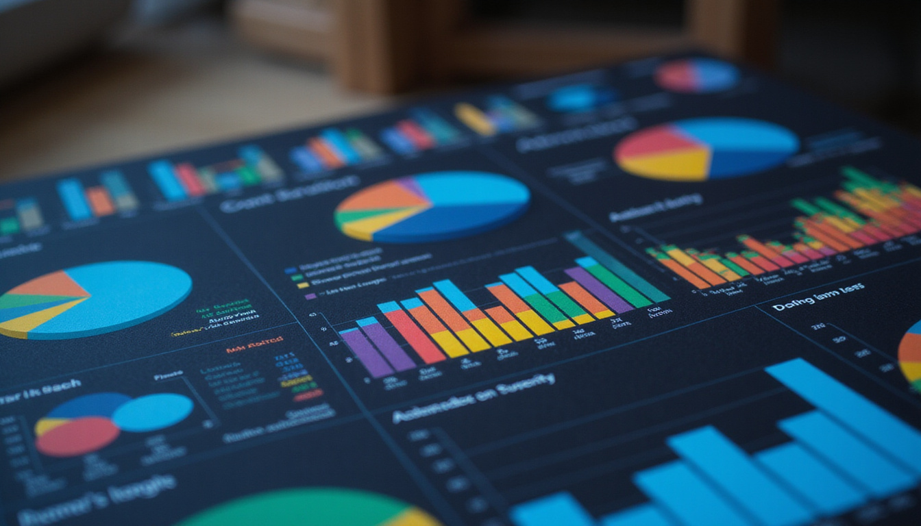
Reduce Cognitive Load: Less Noise, More Signal
Good chart synthesis respects how people actually read visuals. The goal is to reduce cognitive load so the main message becomes obvious.
Apply these practices:
-
Declutter each chart
- Remove heavy gridlines, unnecessary borders, 3D effects, and background images.
- Limit data series to what’s needed for the story.
-
Use hierarchy
- Strong, descriptive titles; smaller labels; lighter gridlines.
- Bold the numbers or labels that matter most.
-
Chunk information logically
- Group related charts together in sections.
- Use whitespace intentionally to separate different ideas.
-
Leverage pre-attentive attributes
- Color, size, and position can instantly draw attention where you want it.
- Use them sparingly so your highlights stand out.
The more work you do to simplify and structure, the easier it is for your audience to see what matters.
Show Relationships, Not Just Individual Metrics
The power of chart synthesis lies in showing how metrics relate, not just what each metric is. You can reveal cause-and-effect patterns, trade-offs, and correlations.
Ways to show relationships:
-
Side-by-side comparison
- Place charts with the same x-axis (e.g., months) directly aligned vertically.
- Viewers can scan up and down to see how curves move together.
-
Derived charts
- Start with raw metrics, then synthesize into a new chart:
- Revenue vs marketing spend
- Conversion rate vs page load time
- Start with raw metrics, then synthesize into a new chart:
-
Small multiples
- Many small, similar charts (e.g., one per region) make patterns and outliers obvious.
-
Before–after views
- Show impact of a change (e.g., pre- and post-campaign metrics) with consistent scales.
This is where chart synthesis becomes more than presentation; it becomes analysis.
Add Annotations to Bridge Data and Insight
Annotations are the glue in effective chart synthesis. They make your reasoning explicit, so viewers don’t have to guess why something matters.
Use annotations to:
- Call out peaks, drops, or inflection points
- Mark events: launches, outages, policy changes
- Summarize the takeaway in short, direct language
For example, instead of a bare line chart, you might add:
- A vertical line with label: “New pricing rolled out”
- A note: “Churn drops 2.3 pts over next 90 days”
- A shaded area: “Promo period”
Annotations transform charts from raw visuals into readable arguments.
Common Chart Synthesis Mistakes to Avoid
Even with good intentions, certain patterns undermine clear, compelling visual stories.
Avoid these pitfalls:
-
Too many chart types at once
- Stick to a small set of familiar charts for a given narrative.
-
Inconsistent colors for the same category
- This forces viewers to re-learn the legend on every slide or dashboard.
-
Mixed scales that deceive
- Manipulating axes (e.g., truncating baselines) can exaggerate or hide changes and erode trust.
-
Overloaded dashboards
- More charts are not more insight. Cut anything that doesn’t directly support the story.
-
No context or benchmarks
- Numbers without baseline or target (e.g., “CTR = 3.4%”) raise more questions than they answer.
Good chart synthesis is as much about what you leave out as what you include.
A Simple Workflow for Effective Chart Synthesis
Here’s a practical step-by-step approach you can follow:
- Clarify the central question and decision.
- List all potential metrics and visuals.
- Select 4–8 charts that directly support the narrative.
- Define an order that follows context → change → cause → consequence → recommendation.
- Standardize visuals (colors, fonts, scales, labels).
- Annotate critical points and add concise headlines to each chart.
- Review with a test audience and refine based on what confused them.
Quick chart synthesis checklist
- [ ] Clear audience and decision identified
- [ ] Charts ordered to tell a single coherent story
- [ ] Consistent color, axes, and formatting
- [ ] Annotations on all major inflection points
- [ ] Unnecessary charts or metrics removed
- [ ] One primary takeaway per section or slide
Use this as a guardrail when you build dashboards, reports, or investor decks.
Tools and Techniques That Support Chart Synthesis
Many visualization tools now support features tailored to chart synthesis:
-
Dashboard tools (Tableau, Power BI, Looker, Mode)
- Support consistent themes, parameters, and cross-filtering between charts.
-
Notebook environments (Jupyter, RMarkdown)
- Combine narrative text, code, and charts in one flowing story—ideal for analytical readers.
-
Design tools (Figma, Illustrator, Keynote, PowerPoint)
- Perfect for polishing key charts and aligning layouts for executive presentations.
Regardless of the platform, the principles of chart synthesis stay the same: clarity, coherence, and purpose.
For deeper principles on visual perception and good chart design, resources like Edward Tufte’s work and the Data Visualization guidelines from the UK government (source: GOV.UK data visualization guidance) offer solid best practices.
FAQ: chart synthesis and Visual Data Storytelling
Q1: How does chart synthesis differ from basic data visualization?
Chart synthesis goes beyond making single charts; it’s about orchestrating multiple visuals into a unified, decision-driven story. Basic visualization might stop at “Here are the charts.” Chart synthesis answers: “What do these charts collectively say, and what should we do?”
Q2: What are some best practices for data chart synthesis in dashboards?
For effective data chart synthesis in dashboards, keep a single primary question per view, limit the number of charts, use consistent color and scale, and ensure filters and interactions support natural comparisons instead of adding noise. Always include short, plain-language summaries of key insights.
Q3: How can I learn advanced visual chart synthesis techniques?
Study real examples of strong analytical dashboards, read books on data storytelling and visualization, and practice turning dense reports into short visual narratives. Focus on chart selection, sequencing, and annotation. Over time, you’ll develop an intuition for which combinations best reveal patterns and support decisions.
Turn Your Data Into Stories People Remember
Data alone doesn’t change minds—stories do. chart synthesis is the craft of turning scattered metrics into a clear, persuasive visual argument that busy people can grasp in seconds and remember hours later.
If you’re ready to move beyond cluttered dashboards and forgettable reports, start applying these principles to your next presentation or analysis. Define a central question, choose only the charts that matter, connect them with consistent design, and annotate your key insights.
Take one current report or dashboard, apply the workflow above, and transform it into a tightly edited visual story. Your audience will not only understand your data better—they’ll finally be able to act on it.
Curious about why astrology has fascinated people for centuries? Explore evidence-based perspectives on spirituality, consciousness, and human psychology at SpiritualMindScience.com